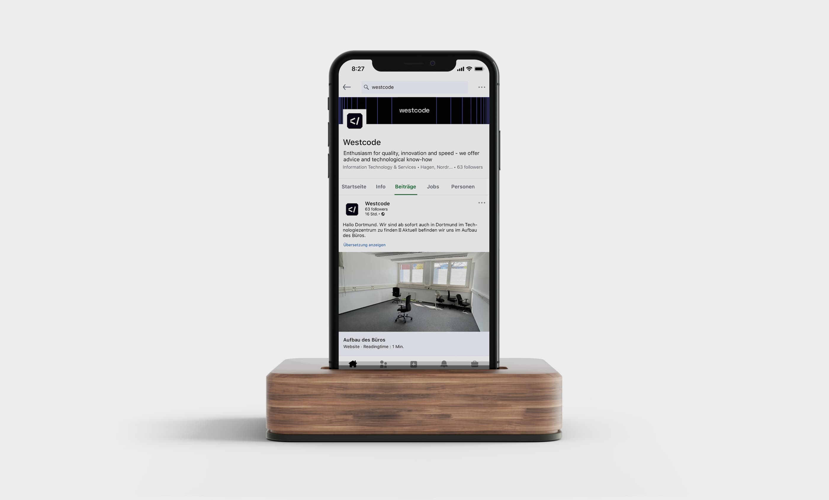
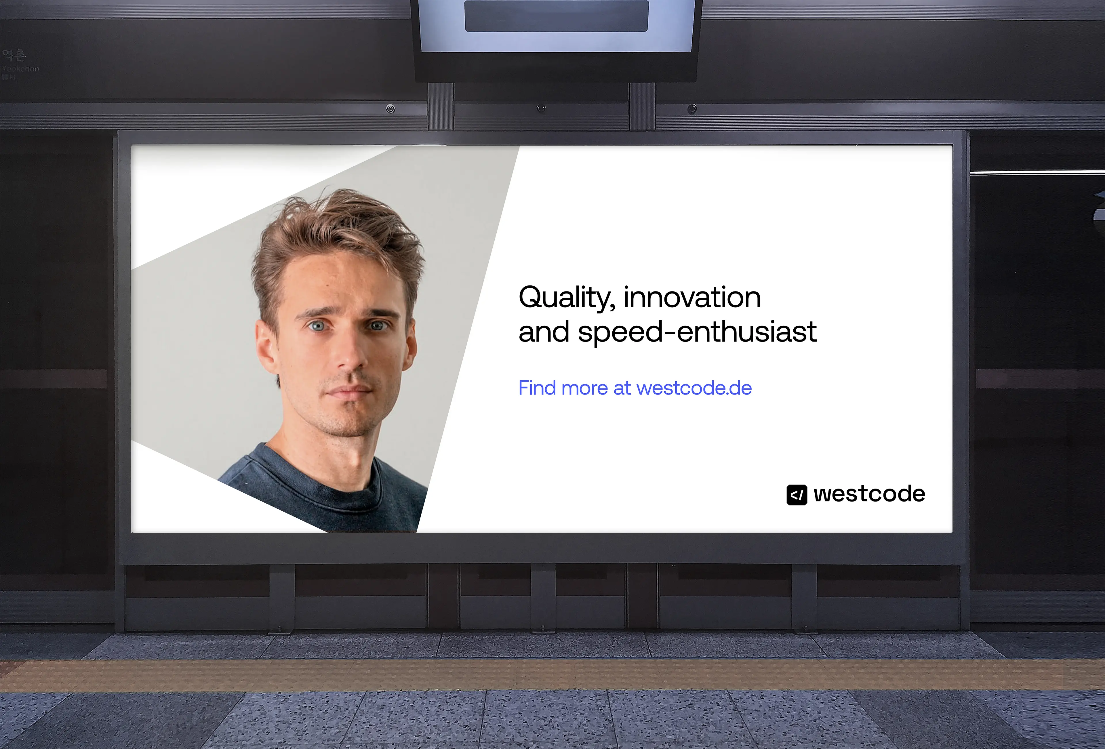
Not really branding, more likely a rebranding! Westcode had a identity that didn't reflect their quality. That's why we are here.
We started with a mood board that captured the essence of Westcode's brand identity. Through collaborative work with the client, we filtered the visuals that were a completely no, and moved west with the yeses.

The naming was good — short, direct and easy to spell. We immediately knew we had to take advantage of that. We made two proposals for the logo and respective overall look: one being more Gen Z focused with vibrant, impactful & playful colors; and the other, our favourite, a modern, timeless design emphasising reliability.

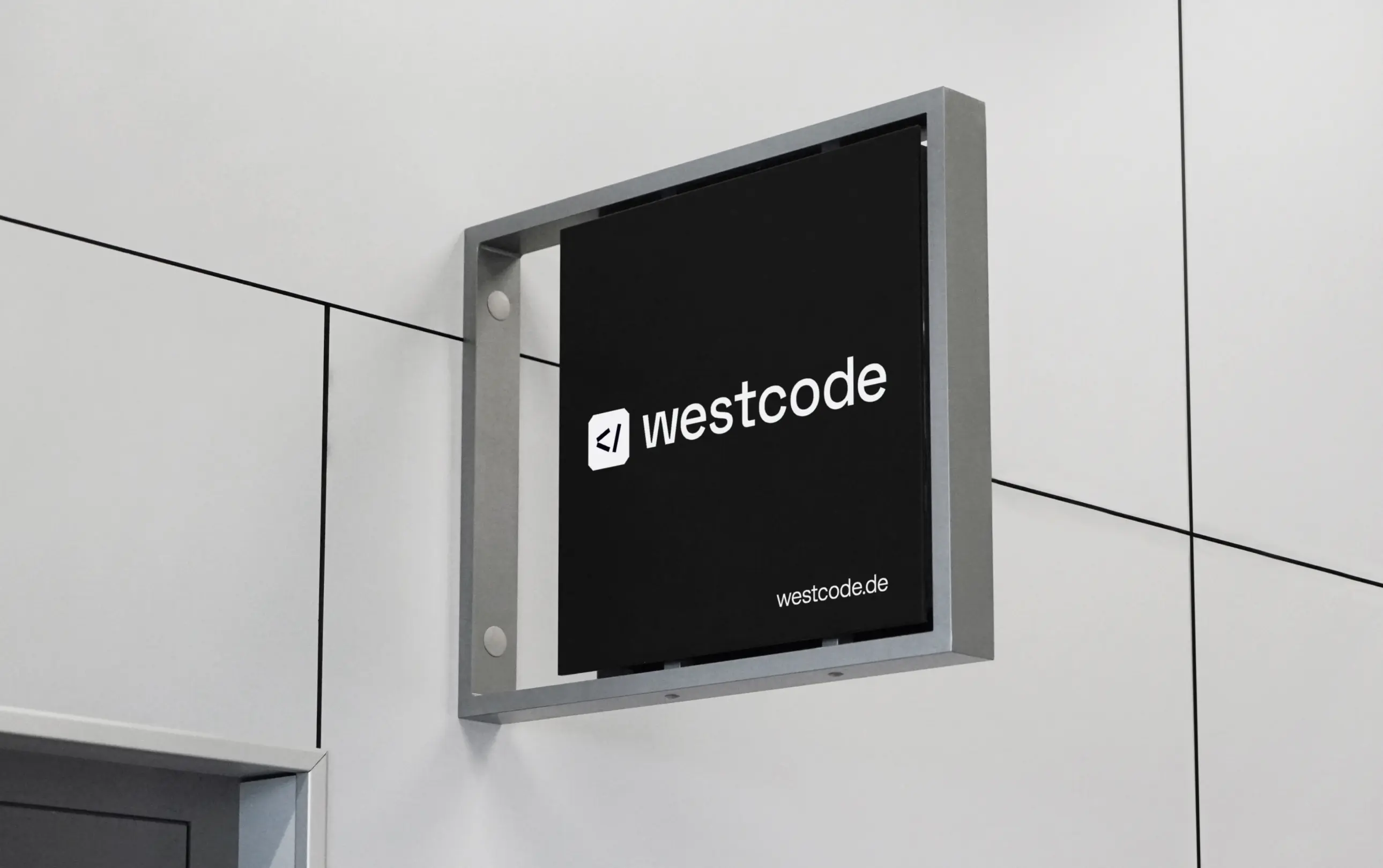
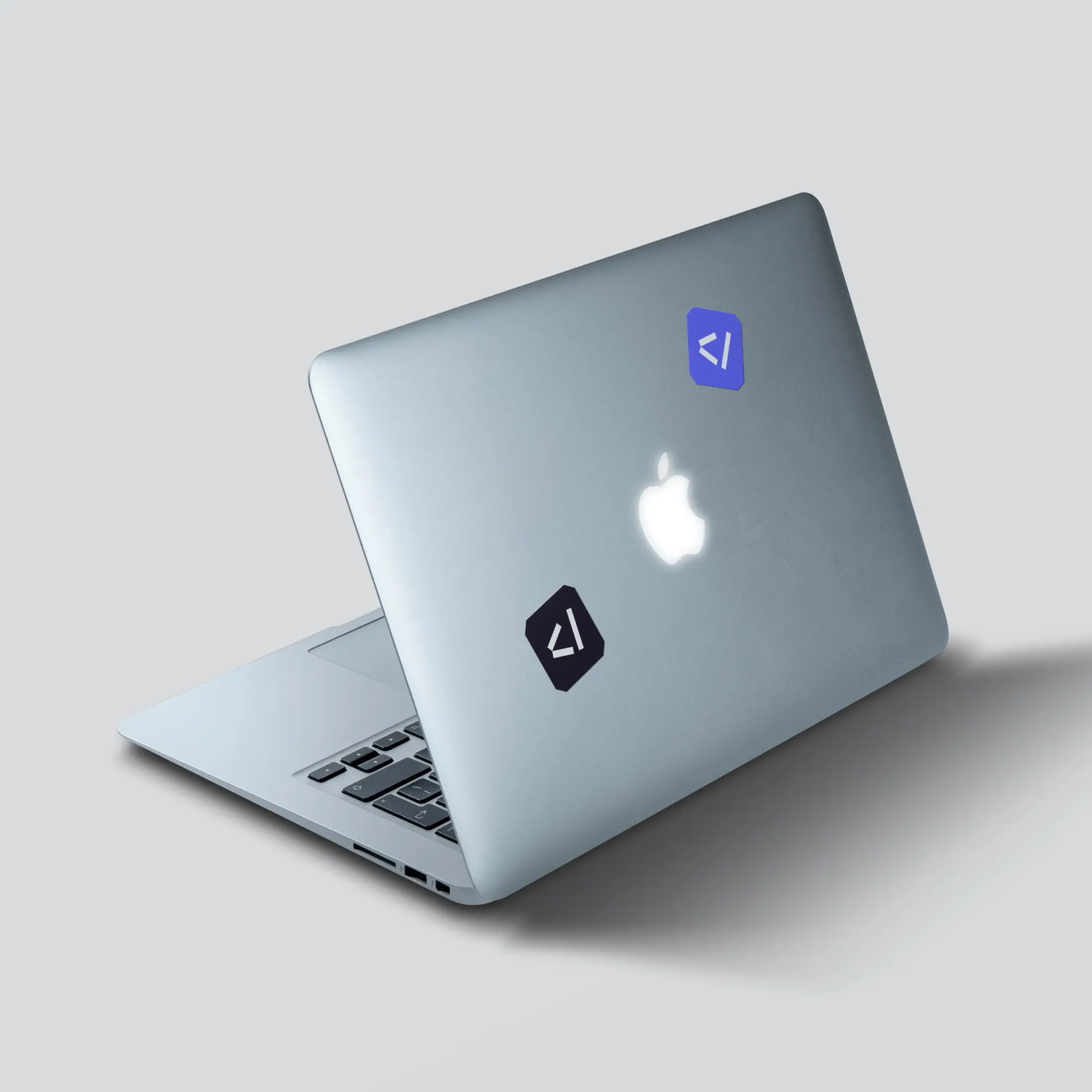
By combining the most desirable elements from each proposal, we were able to deliver a final design that met the client's expectations. It made sense. Although involving the client in the design process is important, presenting multiple options can be daunting — fortunately, our preferred option was chosen without hesitation. The new logo is a blend of modernity and strength, utilising the westward-slanting symbol </ to evoke the concept of coding, as well as the cropped corners to reflect cutting-edge technology.
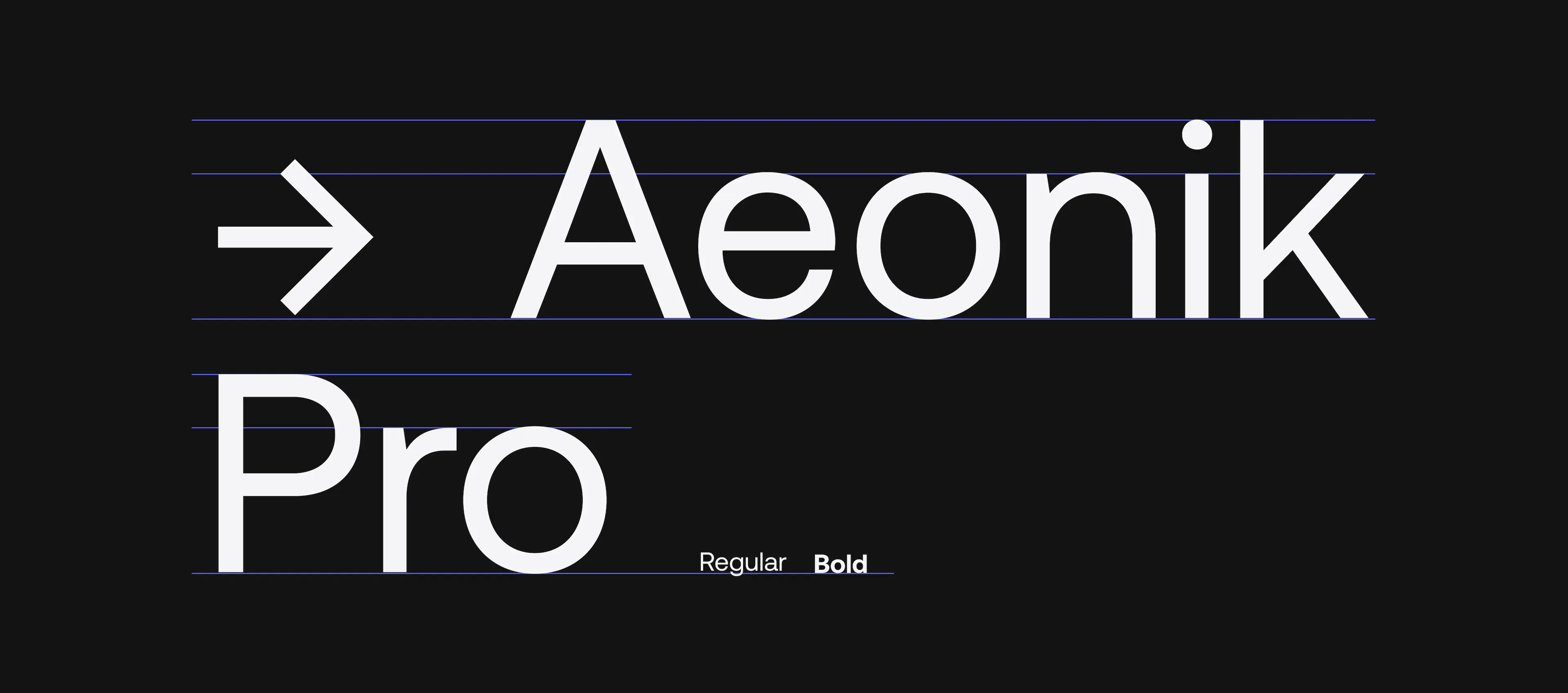
A proper branding must have design guidelines. Can you imagine how catastrophic would be to have nothing to follow up and scale? We could not, so we did it. While we were unable to expand as much as we desired due to contractual limitations, we have laid the groundwork.
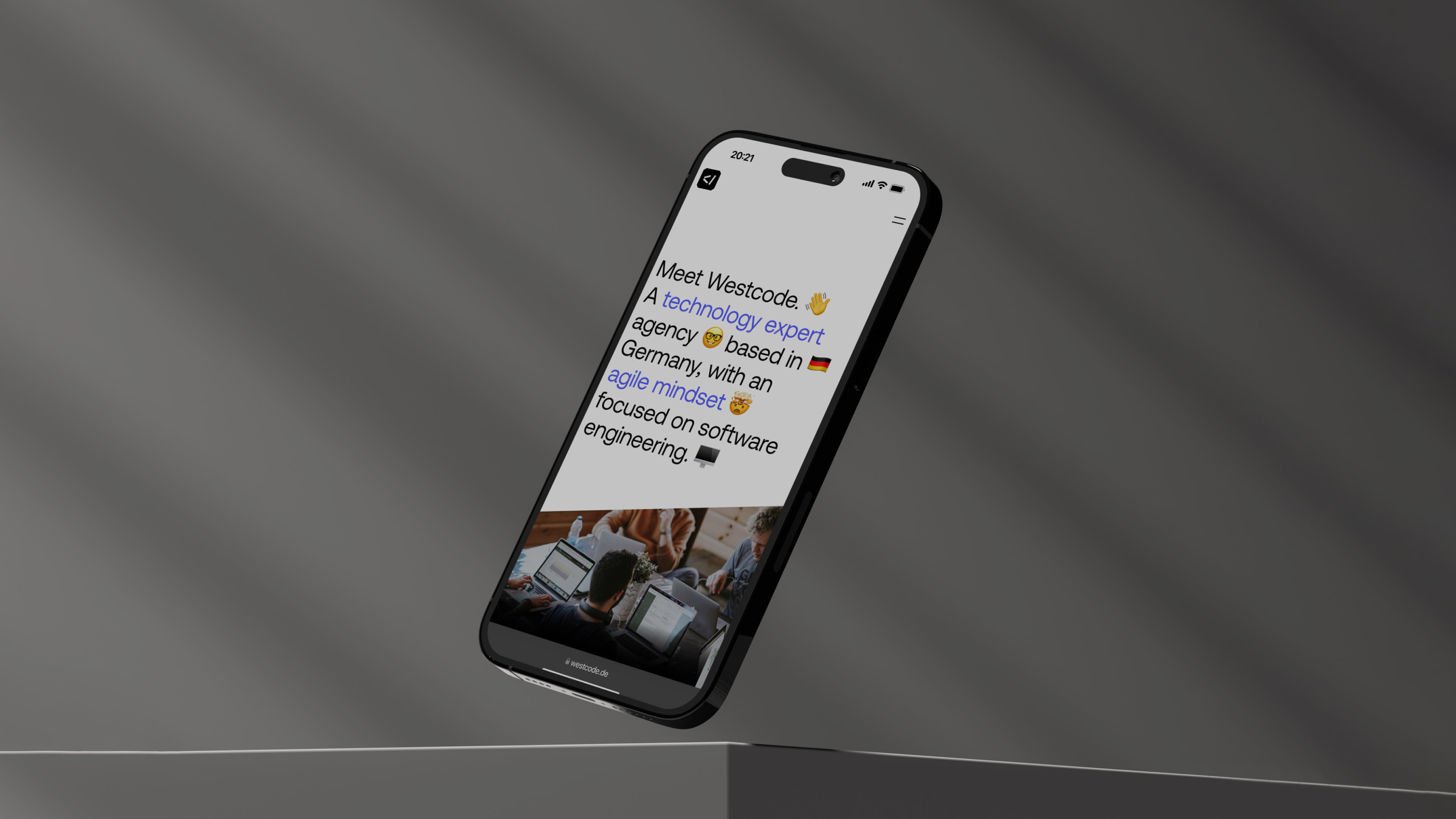
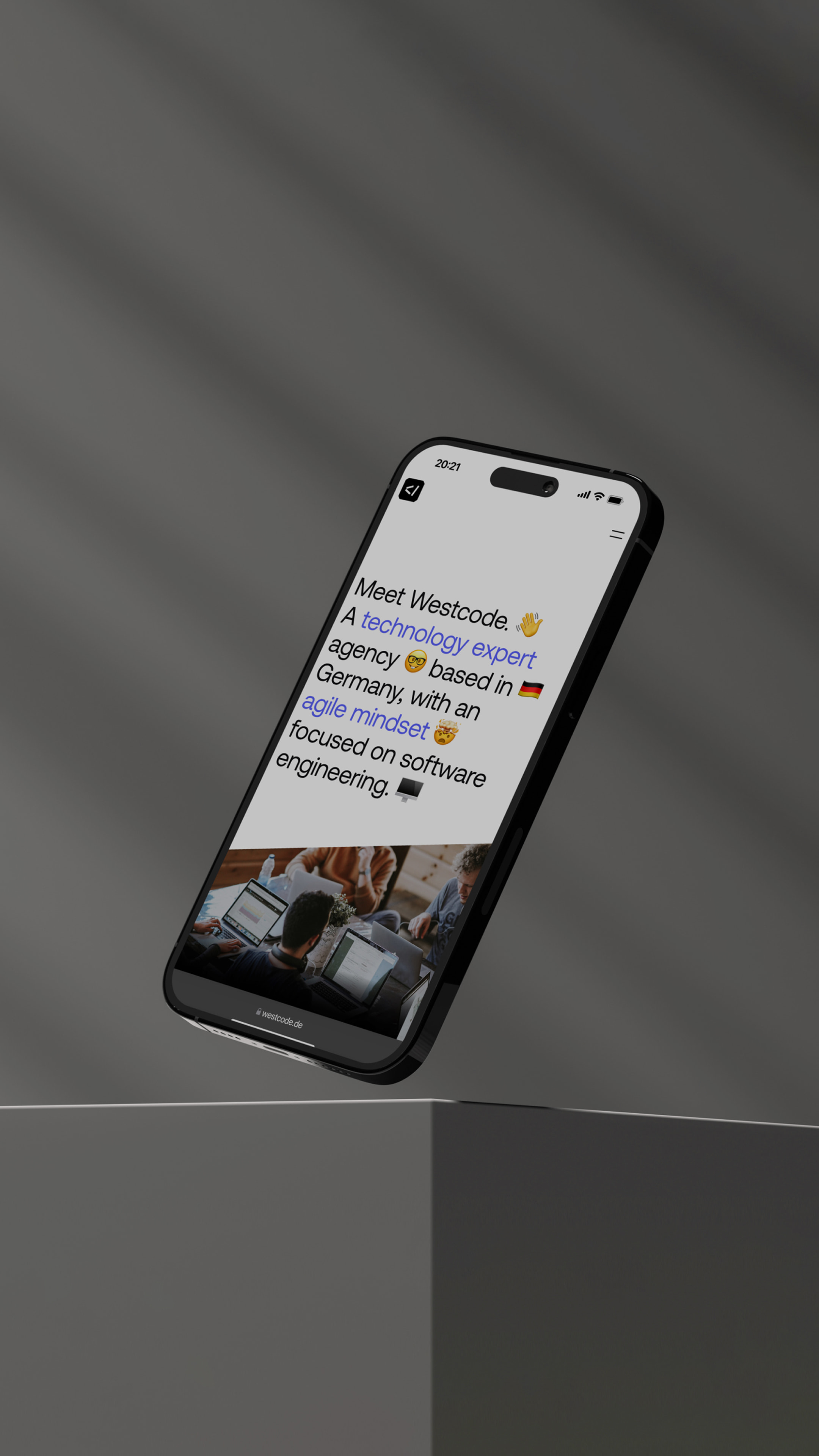
Westcode's website needed to have an impact for potential clients, making it a critical component of their marketing strategy.
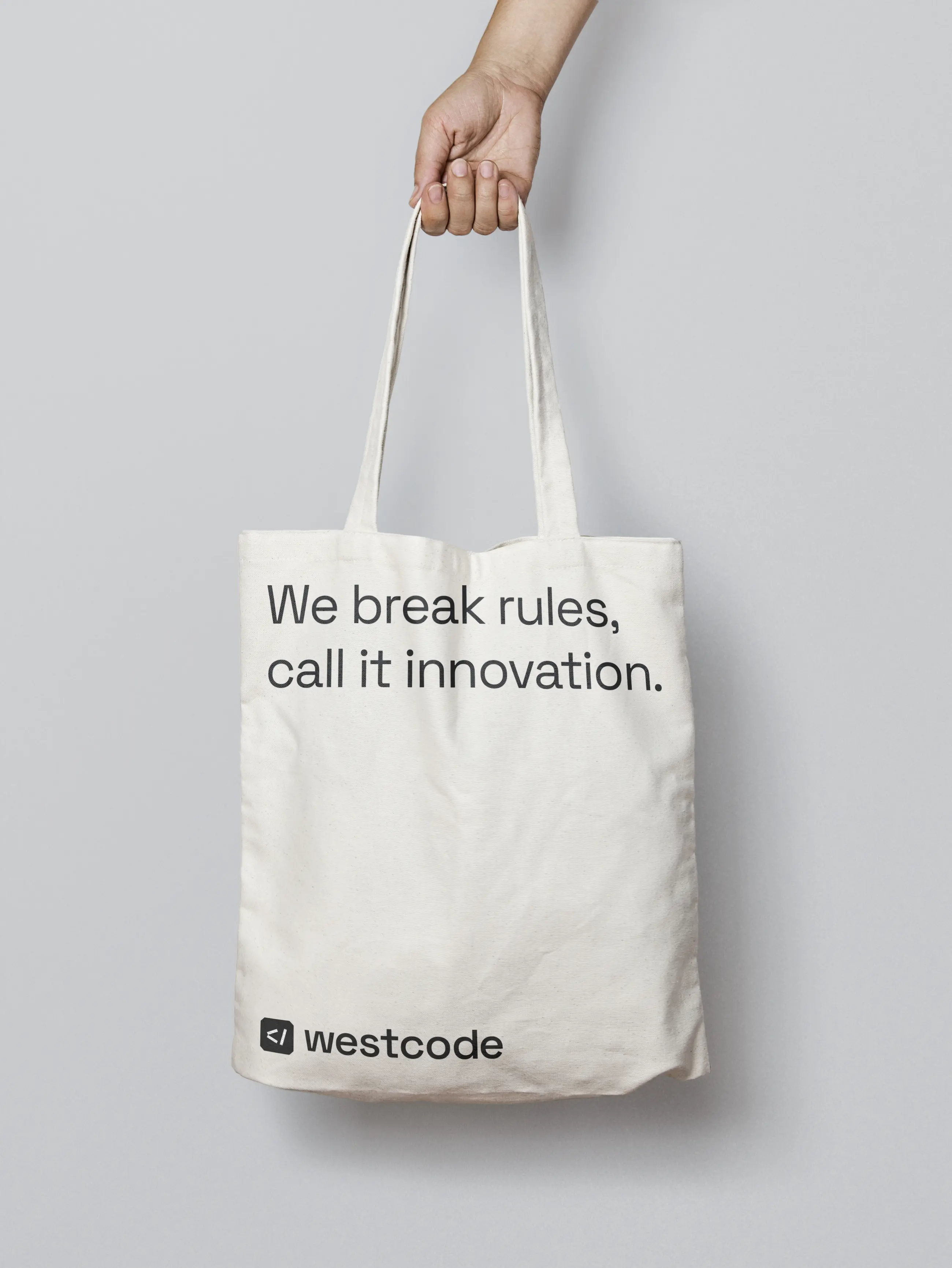
To create this perception, we carefully crafted the copy — well, we tried, it already changed at this point. At least one stayed "We break rules, call it innovation."
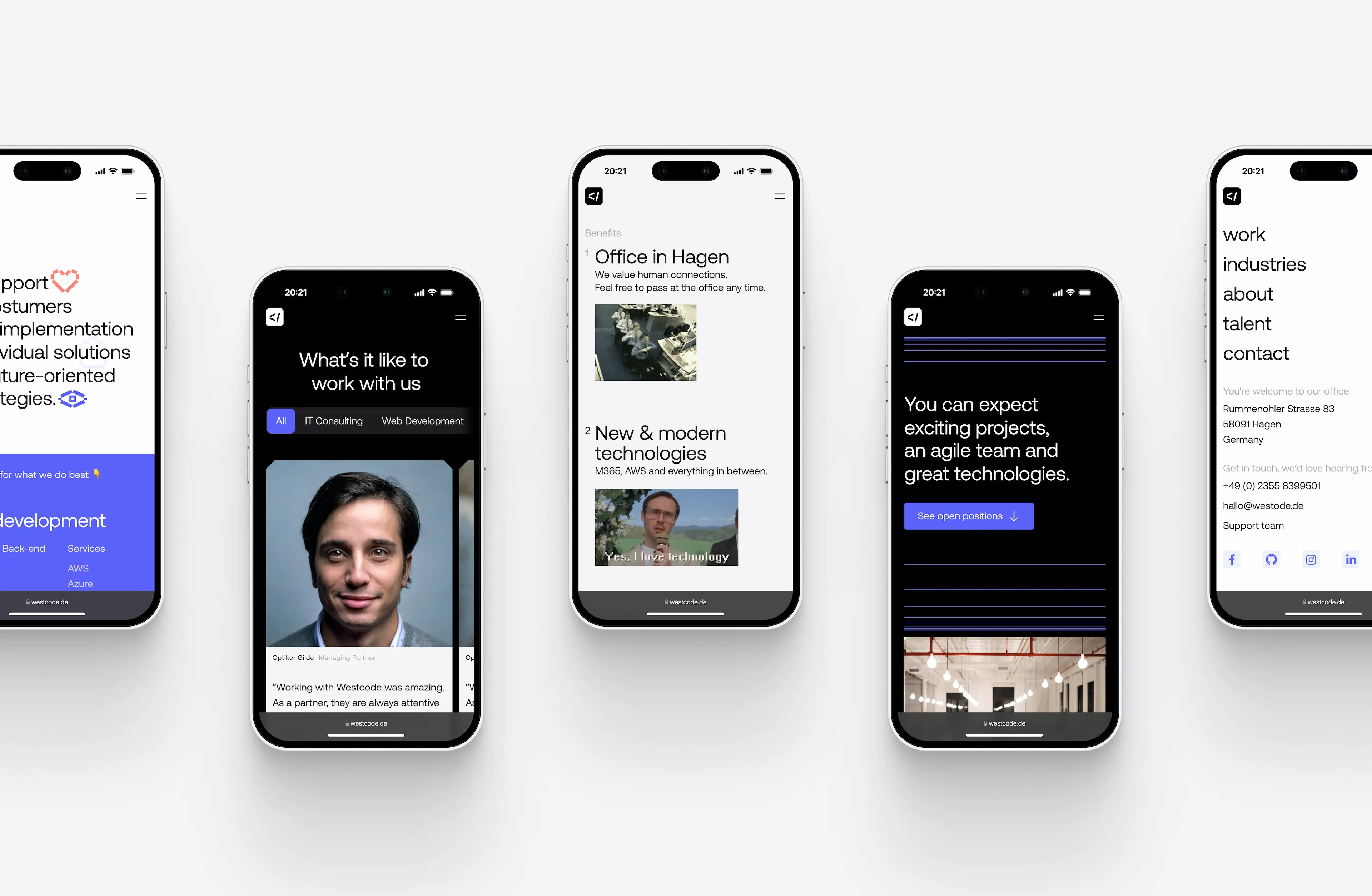
To maintain visual interest, we played with the column grid, which is noticeable on their case studies. And also incorporated floating < elements and hints of blue to bring the brand closer to their clients and make it more memorable. Oh, and for the 404, we have an unconventional icon direction on the button that made the client laugh. Give it a try.

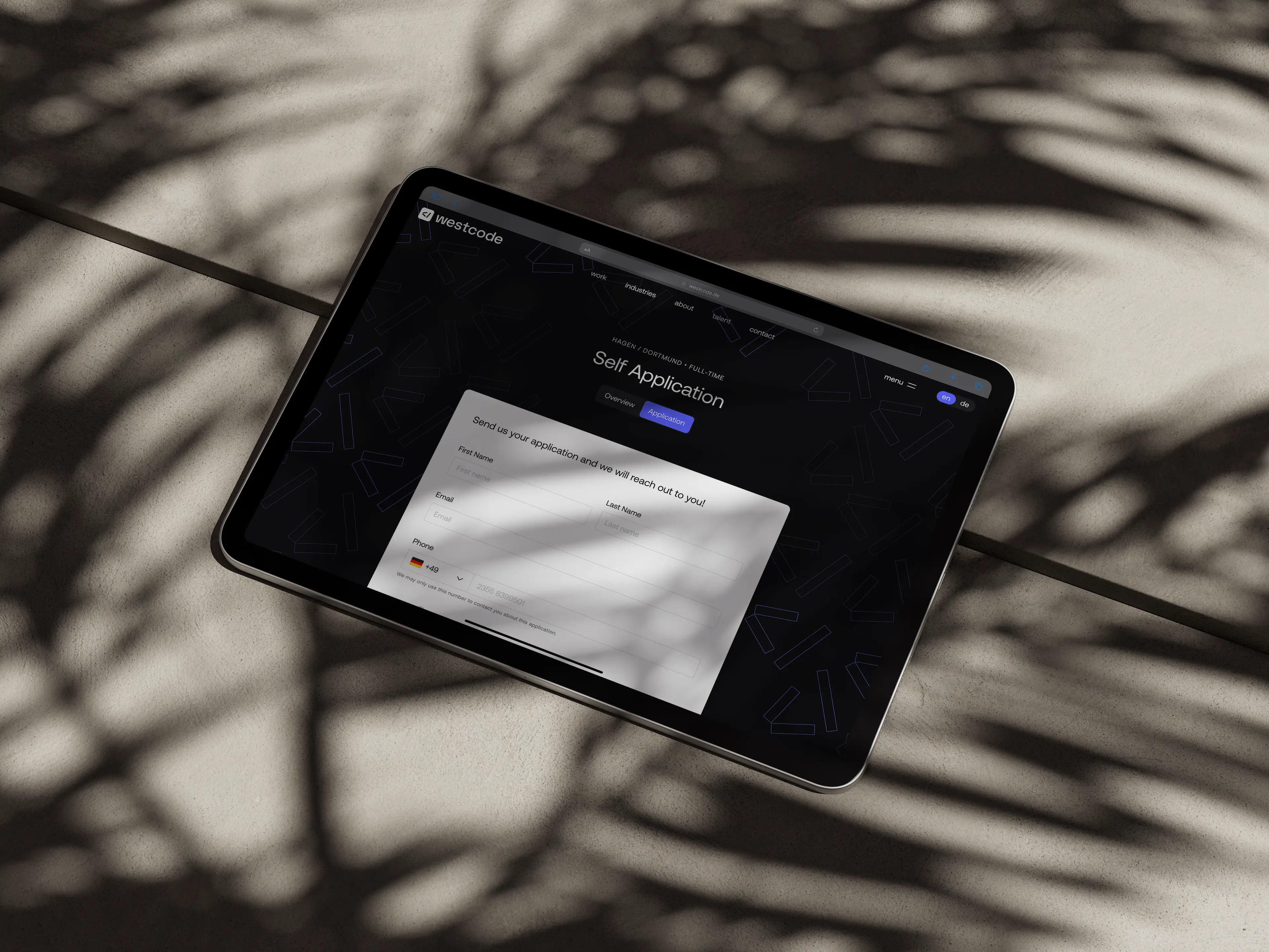
As the company was growing, the careers page required a balance of humor and professionalism to attract potential candidates. Gifs, engaging copy and emojis conveyed a fun workplace culture, while team photos and brand elements added a touch of credibility.
We also delivered the foundation of the design system, which included buttons, icons, inputs, tooltips, tags, and other elements, along with their respective states and navigation components. Consistency is key.

Unfortunately, our process stopped at the delivery stage, but despite not collaborating during development, we still got an honorable mention on Awwwards.
